The Lojban Logo
| The formatting of this page has been checked for following the guidelines of le uitki. |
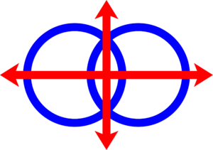
The official Lojban logo is represented by two blue intersecting rings and four red arrows coming in four directions from the center of the logo.
The logo resulted from a competition announced in Ju'i Lobypli journal, issue 13 (August 1990). The competition results were announced in Ju'i Lobypli, issue 14 (March 1991): the winning design was Guy Garnett's.
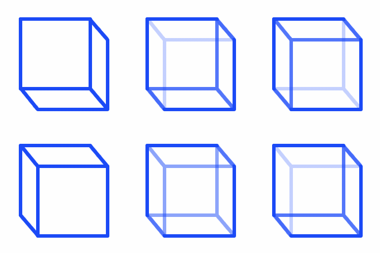
Surprisingly to me at least, there was a clear winner in the logo balloting from Ju'i Lobypli #13. The selected logo was supposed to be on this issue; maybe next time. The winner, designed by Guy Garnett, received a large majority of positive votes among the 35-40 ballots received before the October deadline, and was first choice on many of them. In fact, only 5 ballots were marked as disliking the selection. Of these 5, 3 were in favor of the 2nd place finisher (a distant 2nd, but with far more 'likes' than 'dislikes'). This 2nd place logo, the intersecting planes design by Jamie Bechtel, apparently suffered some vote loss from being hand-drawn compared to Guy's polished computer-generated images. (Almost all negative votes on this design also voted against all other hand-drawn designs.) As a result, we intend to try this on some publications as well, after computerizing it, and see what people think. Thus we have two logos, which were opposed by only 2 people among the voters. A couple of people sent in new designs after the ballot was produced, and I unfortunately missed one by Kerry Pearson in preparing the ballot. But we needed to have a final decision, and these will be the logos for at least the next few years.
— ju'i lobypli 14
The Necker Cube[1][2] was the "2nd place logo", an alternative proposal by Jamie Bechtel, and some people (at least Nick Nicholas) wish it had won the vote instead. The "two logos" principle[3] seems to have been forgotten in the three years between the vote and doing anything about it; the Necker Cube might thus be legitimately resuscitated. Of course, the use of the Venn-diagram logo on The Book means it must needs remain the primary logo.
The logo represents both the LLG and Lojban.
there is a commercial purpose to the logo. It is a symbol for la lojbangirz. as well as, and possibly more than, for the language (this unfortunately may not have been in the minds of the designers and voters, but, oh well). While we are a non-profit organization, we must operate as a business, sending out correspondence, fundraising letters, etc. The logo, printed by computer with our letterhead, will enhance the visual appearance of our business correspondence, calling attention to our letter. (At least this is how the theory goes.)
— ju'i lobypli 14
Symbolism
Guessing: Venn Diagram = Logic; Axes = ... Algebra? Cultural neutrality, via the four points of the compass? Sapir-Whorfesquery, as in "your mind can go anywhere, thanks to Lojban?"
Someone who recognized the Lojban logo as being the Lojban logo, but didn't know what the parts were supposed to mean, asked "the two blue circles represent hemispheres of the earth and the arrows indicate the universality of Lojban?" about the best interpretation I've heard of it yet.

