Talk:The Lojban Logo
Jump to navigation
Jump to search
The Lojban Logo (which appears at the top left of Wiki pages.) Available also from la tsali's webpage: http://arj.nvg.org/lojban/jbosinxa.html
Discussion
- I suspect the logo has not been so used; does anyone know?
- Let me get this straight: both the symbols being spatially-perceptual ambiguities, they are appropriate for a logically-unambiguous language how?
- It's not. It's an appropriate symbol for the Anti-Lojban.
- nitcion:
- They are intended to illustrate how mind-blowing the Sapir-Whorf effects are, I think. At least, the Necker Cube is. But Paul Dounda expressed the same criticism in JL13.
- I agree about the Necker cube, but I always thought of this one as being just weird. I don't understand it at all. How is it ambiguous? What does it mean, besides just 'lojban'?
- The intersecting circles can be seen as ends of a cylinder two ways.
- .mark.:
- On a lighter note, I suppose you folks should see the Animated Lojban Logos I made a while ago, for fun (on another page because animated GIFs are Evil and should be placed someplace special.)
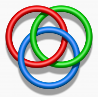
- Borromean rings were also proposed as Lojban logo.
