Talk:Tiki forum archive/Forum 5/8240
Source: 2013 Tiki forum 5, thread #8240. Original authors, UTC times, post IDs, and reply-parent IDs are preserved. This is an archive, not an active article discussion.
Alternative Lojban Logos
Alternative Lojban Logos
DPic · 2009-11-22 17:41 UTC · Tiki post #8240
really liked that didn't have such an unsighly bold clash of bright red and blue. They even included "a logical language" in every combination of english, lojban, and lojban in tengwar (major props for that!). I was wondering if those were uploaded anywhere else or if whoever created them could upload them somewhere else. I think it was made by whoever made that alternative homepage for lojban which looked amazing!
Also, what is the significance of the current logo? I personally don't realy
like it...anybody else have thoughts on the matter?Alternative Lojban Logos
seryf · 2009-11-22 17:41 UTC · Tiki post #8241 · reply to Tiki post #8240
Original Message-----
From: Danny Piccirillo <[email protected]> To: [email protected] Sent: Sun, 17 May 2009 5:16 pm Subject: [lojban] Alternative Lojban Logos
I remember someone on jbotcan posted a bunch of alternative lojban logos i really liked that didn't have such an unsighly bold clash of bright red and blue. They even included "a logical language" in every combination of english, lojban, and lojban in tengwar (major props for that!).?
I was wondering if those were uploaded anywhere else or if whoever created them could upload them somewhere else. I think it was made by whoever made that alternative homepage for lojban which looked amazing!?
Also, what is the significance of the current logo? I personally don't realy like it...anybody else have thoughts on the matter??
Alternative Lojban Logos
DPic · 2009-11-22 17:41 UTC · Tiki post #8242 · reply to Tiki post #8240
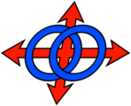
the symbolism of venn diagrams? i could see how that might be related to lojban, but i don't think it is quite symbolic of it in any more than one or maybe two ways. The four directions? Now that i have no idea what it has to do with lojban... I think that at the very least the colors have to change-- i like what has been done: here http://lojban.jim.dabell.name/
IMHO, the current symbiol is a little bit too complex and i'm not sure what it has to do with lojban. It might have some significance but i think it's worth discussing. Not a big deal, just wanted to mention it.
On Sun, May 17, 2009 at 20:42, <[email protected]> wrote:
> I happen to like both the logo and the flag. the logo invokes the > symbolism of venn diagrams, and the arrows as perhaps the four directions. > the flag symbolizes humanity and the relationships between people, and of > course has the name on it. i like both, but would welcome the idea of more > symbols too. > > > -----Original Message----- > From: Danny Piccirillo <[email protected]> > To: [email protected] > Sent: Sun, 17 May 2009 5:16 pm > Subject: [lojban] Alternative Lojban Logos > > I remember someone on jbotcan posted a bunch of alternative lojban logos i > really liked that didn't have such an unsighly bold clash of bright red and > blue. They even included "a logical language" in every combination of > english, lojban, and lojban in tengwar (major props for that!). > I was wondering if those were uploaded anywhere else or if whoever > created them could upload them somewhere else. I think it was made by > whoever made that alternative homepage for lojban which looked amazing! > > Also, what is the significance of the current logo? I personally don't > realy like it...anybody else have thoughts on the matter? > > ------------------------------ > *A Good Credit Score is 700 or Above. See Yours in Just 2 Easy Steps!<http://pr.atwola.com/promoclk/100126575x1222585011x1201462751/aol?redir=http://www.freecreditreport.com/pm/default.aspx?sc=668072%26hmpgID=115%26bcd=Mayfooter51709NO115> > *
>Alternative Lojban Logos
Minimiscience · 2009-11-22 17:41 UTC · Tiki post #8243 · reply to Tiki post #8240
skamyxatra. > Is there a flag design that is different from the logo? Link please? > > the symbolism of venn diagrams? i could see how that might be related to > lojban, but i don't think it is quite symbolic of it in any more than one or > maybe two ways. The four directions? Now that i have no idea what it has to > do with lojban... .skamyxatra
I think by "flag" he's referring to the "alternate" logo showing a humanoid with a series of boxes level with its head (similar to the favicon for the Lojban website). As far as I know, neither is officially regarded as the flag of anything, though the main logo is referred to as a flag several times on the page <http://www.lojban.org/tiki/tiki-index.php?page=Lojban+Logo>; that page also gives the origins of the logo and some speculation as to its meaning.
> IMHO, the current symbiol is a little bit too complex and i'm not sure what > it has to do with lojban.
Two circles and two arrows is too complex for a symbol? Stay away from heraldry and mandalas, then.
mu'omi'e .kamymecraijun.
-- mi citka loi cidjrspageti fi'o sanmi lo cersai
To unsubscribe from this list, send mail to [email protected]
with the subject unsubscribe, or go to http://www.lojban.org/lsg2/, or if
Alternative Lojban Logos
seryf · 2009-11-23 11:17 UTC · Tiki post #8254 · reply to Tiki post #8240
Original Message-----
From: Minimiscience <[email protected]> To: [email protected] Sent: Sun, 17 May 2009 7:49 pm Subject: [lojban] Re: Alternative Lojban Logos
de'i li 17 pi'e 05 pi'e 2009 la'o fy. Danny Piccirillo .fy. cusku zoi
skamyxatra.
> Is there a flag design that is different from the logo? Link please?
>
> the symbolism of venn diagrams? i could see how that might be related to
> lojban, but i don't think it is quite symbolic of it in any more than one or
> maybe two ways. The four directions? Now that i have no idea what it has to
> do with lojban...
.skamyxatra
I think by "flag" he's referring to the "alternate" logo showing a humanoid with a series of boxes level with its head (similar to the favicon for the Lojban website). As far as I know, neither is officially regarded as the flag of anything, though the main logo is referred to as a flag several times on the page <http://www.lojban.org/tiki/tiki-index.php?page=Lojban+Logo>; that page also gives the origins of the logo and some speculation as to its meaning.
> IMHO, the current symbiol is a little bit too complex and i'm not sure what > it has to do with lojban.
Two circles and two arrows is too complex for a symbol? Stay away from heraldry and mandalas, then.
mu'omi'e .kamymecraijun.
-- mi citka loi cidjrspageti fi'o sanmi lo cersai
To unsubscribe from this list, send mail to [email protected]
with the subject unsubscribe, or go to http://www.lojban.org/lsg2/, or if
you're really stuck, send mail to [email protected] for help.
Alternative Lojban Logos
Stela Selckiku <[email protected]> · 2009-11-23 11:17 UTC · Tiki post #8256 · reply to Tiki post #8240
<[email protected]> wrote: > the symbolism of venn diagrams? i could see how that might be related to > lojban, but i don't think it is quite symbolic of it in any more than one or > maybe two ways. The four directions? Now that i have no idea what it has to > do with lojban...
What the logo symbolizes to me is two different styles of expressing meaning.
The Venn diagramm shows how meaning can be narrowed and focused by layering imperfect imprecise descriptions so that the resulting intersection becomes smaller and more precise. In Lojban this style of meaning is implemented very clearly with for instance "poi", and in a less distinct way with tanru, etc.
The arrows paint an X-Y chart. This symbolizes a different way of forming meaning, starting from a solid absolute ground so you can organize the relations of things. Cardinal directions are a fine example of this pattern-- by choosing a few fixed lines, you organize the whole space. In Lojban this kind of grounding is most distinct perhaps in the logical connectives, but also in for instance the attitudinal system, which grounds an utterance relative to its context and speaker.
So together the circles and arrows represent to me the process of expressing meaning in Lojban, grounding the vague but focusable semantic spaces of the brivla in the definite solid structure of the grammar.
.i mi jbobau lanci nelci .i mi nelci le ji'a te lanci noi la .epkat.
finti zi'e noi melbi simsa lo bridi be lo stedu
I'm a Lojban flag liker. I like also the flag design that Eppcott
made, and which is beautifully similar to a bridi with a head as its
selbri.
mu'o mi'e la se ckiku
To unsubscribe from this list, send mail to [email protected]
with the subject unsubscribe, or go to http://www.lojban.org/lsg2/, or if
Alternative Lojban Logos
Stela Selckiku <[email protected]> · 2009-11-23 11:18 UTC · Tiki post #8263 · reply to Tiki post #8240
un, May 17, 2009 at 8:55 PM, Danny Piccirillo <[email protected]> wrote: > the symbolism of venn diagrams? i could see how that might be related to > lojban, but i don't think it is quite symbolic of it in any more than one or > maybe two ways. The four directions? Now that i have no idea what it has to > do with lojban...
What the logo symbolizes to me is two different styles of expressing meaning.
The Venn diagramm shows how meaning can be narrowed and focused by layering imperfect imprecise descriptions so that the resulting intersection becomes smaller and more precise. In Lojban this style of meaning is implemented very clearly with for instance "poi", and in a less distinct way with tanru, etc.
The arrows paint an X-Y chart. This symbolizes a different way of forming meaning, starting from a solid absolute ground so you can organize the relations of things. Cardinal directions are a fine example of this pattern-- by choosing a few fixed lines, you organize the whole space. In Lojban this kind of grounding is most distinct perhaps in the logical connectives, but also in for instance the attitudinal system, which grounds an utterance relative to its context and speaker.
So together the circles and arrows represent to me the process of expressing meaning in Lojban, grounding the vague but focusable semantic spaces of the brivla in the definite solid structure of the grammar.
.i mi jbobau lanci nelci .i mi nelci le ji'a te lanci noi la .epkat.
finti zi'e noi melbi simsa lo bridi be lo stedu
I'm a Lojban flag liker. I like also the flag design that Eppcott
made, and which is beautifully similar to a bridi with a head as its
selbri.
mu'o mi'e la se ckiku
To unsubscribe from this list, send mail to [email protected]
with the subject unsubscribe, or go to http://www.lojban.org/lsg2/, or if